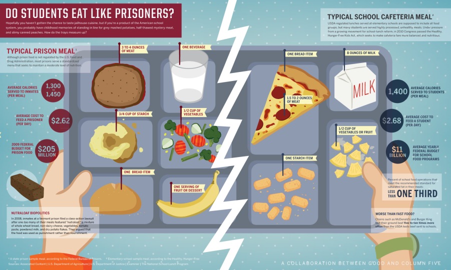
Recently there’s been a lot of controversy around school lunches and many have been compared to the meals served in prison. There are countless mothers angry with the government, and rightly so, for allowing this quality gap where prisoners are served heather and more well-rounded lunches than growing children. In this infographic from Good magazine, we get a visual on the typical meals in our schools and prisons.
At first glance, I had already decided that I loved this infographic. It’s very visual and the side-by-side depiction of the food in the actual tray, made it easy for me to understand and it’s also fun to look at. It’s obvious to see that the prisoners receive larger and healthier portions. For example, students only get 1/2 cup of vegetables OR fruit, while the prisoners get 1/2 cup of vegetables AND a serving of fruit. It makes no logical sense for the prisoners to be better fed than growing students, who are the pivotal future generation.
Then, on the left and right sides of this visual, we get to see specific numbers and statistics to further implement the difference between the two lunches. Surprisingly, the school lunches are provided with a larger budget and cost per mouth. This greatly contrasts with the large depiction of the lunch trays. The average calories for the two are also very similar, which can be seen as good and bad. Should adolescents be receiving the same amount of calories for one meal as full grown adults? Another interesting fact shown in this infographic is how they imply that school lunches are actually worse than fast food since many fast food chains test their ground beef 5-10 times more often than schools. It’s common knowledge that fast food is unhealthy to eat even once in a while, so why is it okay for our government to feed students worse food on a daily basis?
This is different from traditional journalism in that the reader gets to pick which facts to read first. Of course the eye is guided by the size and colors of the infographic, but compared to a traditional article, the reader gets a lot more freedom. It’s also more interesting to visually see a tray of food rather than reading about how “prisoners receive 3/4 cup of starch, one beverage, one bread item, etc…” However, some shortcomings include the lack of context provided by this infographic. How did they come up with this data? Did they sample ALL of the schools and prisons in the US? Or did they randomly pick several per state? Does this include private schools, or just public? The infographic is very visually appealing, but it leaves a lot of questions to be asked.
